Your brand
A Bio People Remember
A Chaturbate bio should help a visitor understand you, find the next stream and choose how to participate. Strong artwork attracts attention; accurate information and useful links make that attention easier to act on. This guide explains how to plan a Chaturbate HTML bio, choose or adapt a template, organize the content and check the finished page on mobile. It also shows how to evaluate a redesign without inventing promises about higher tips. Platform requirements are linked to official sources; the layouts, examples and maintenance routines are our practical design recommendations.
Give the bio a useful job
Before choosing a font, write down the questions a new visitor asks: Who is this creator? What does the room feel like? When are they back? How do I join in? Where are the current membership benefits? These questions become your content brief. A beautiful page can still fail if the only accurate schedule is hidden halfway down a giant image.
Separate recognition from action. Recognition comes from a memorable photo treatment, color palette and tone of voice. Action comes from readable information and a link whose destination is clear. You need both. A page made only of buttons feels impersonal; a page made only of decorative portraits leaves visitors guessing what to do next.
Choose one primary outcome for the first version. If people keep missing your broadcasts, make the schedule and follow invitation unmistakable. If regulars ask what membership includes, give the Fanclub section a clear promise. You can show several support options, but they do not all need equal visual weight. The first screen should communicate a priority rather than compete with itself.
Know where the HTML belongs
Chaturbate allows HTML customization in the About Me and Wish Lists fields. Its published list includes links, images, paragraphs, lists and headings such as h1, h2 and h3. The same guidance says custom overlays must not cover the site logo, advertising areas or navigation. Use the platform’s current editor and supported elements as your boundary. Official bio customization guide ↗.
A standalone website preview is not proof that every effect will survive inside a profile. Save your existing bio first, install the new version and inspect the actual result. Check image dimensions, spacing and links after saving. If a complex effect fails, simplify it rather than building the whole layout around a browser behavior the platform does not reliably preserve.
Keep three deliverables separate: the editable design, the exported pictures and the final HTML. A designer should be able to update a date without reconstructing the page from screenshots. Give files descriptive names and keep a dated working copy. This small amount of organization makes a future correction much faster, especially when you are changing something shortly before a stream.
Choose a look you can maintain
Start with three words for the room’s mood. Soft, playful and welcoming could lead to pale colors, rounded headings and gentle photo crops. Dramatic, polished and confident could lead to strong contrast, sharper composition and more restrained decoration. These are design choices, not instructions to adopt a personality that feels unnatural when you are live.
Make a small identity kit: a main color, a quiet background color, one accent, a heading style and a plain text style. Choose one repeating visual detail, such as a curved label or a specific photo border. Repeat that detail across your bio, schedule and creator-channel graphics. Consistency should make updates easier, rather than force every block into an identical card.
Use reference pages to identify principles, not to collect things to copy. Notice how a reference gives a headline space, connects text with a portrait or creates a strong contrast between sections. Then build those principles around your own photographs and content. A recognizable identity can be simple; it needs a few intentional decisions repeated well, not a different decorative effect in every paragraph.
READ
ACTCHOOSE A TEMPLATE ↗
Plan sections around real questions
A useful starting order is introduction, schedule, interaction options, room expectations and membership or other current links. Adapt that order to your room. A membership-led creator may bring the Fanclub higher; a creator with irregular seasonal availability may prioritize the next confirmed date. The sequence should reflect what a visitor needs to understand, not simply the order in which you designed the graphics.
Give each section one job and a descriptive heading. About me can carry a brief personal introduction; Schedule should reveal days and times quickly. Clever headings can add personality, but pair them with an obvious label if the meaning is unclear. W3C’s guidance recommends heading structure that communicates the organization of a page to readers and assistive technology. Headings guidance ↗.
Draft the content in plain text before fitting it into artwork. Remove duplicated invitations, old announcements and explanations that belong in a separate conversation. Then decide which details can be combined. A short introduction and schedule might share one composition, while a membership offer deserves its own space. Compact does not mean squeezing everything smaller; it means reducing repetition and making each element earn its place.
| Visitor’s question | What to show |
|---|---|
| Who am I meeting? | One strong photo and a short introduction |
| When can I return? | Current days, times and time zone |
| How do I join in? | A readable menu or clear interaction options |
| What should I know? | Brief, respectful room expectations |
| What does membership include? | Current benefits and one joining action |
Let photos become part of the layout
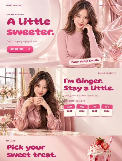
Choose photographs with a clear purpose. A welcoming portrait introduces you; a wider room photograph sets the atmosphere; a detail shot can separate sections without repeating the same face. Plan where text will sit before cropping. An image with quiet space on the left is useful for a left-aligned heading, while a busy background may need a separate text panel.
Vary the composition without losing the identity. One section can use a full-width photograph with a readable caption area, another an unframed cutout beside a schedule, and another a simple graphic with no portrait at all. Keep the number of competing focal points low. A face, a giant heading, three badges and four arrows rarely need to share the same small space.
Check the final crop at the size people will see. Avoid cutting awkwardly through hands, hair or important clothing details. If you use generated or heavily edited images, inspect anatomy, object intersections and background continuity closely. A beautiful color palette does not hide a visible visual error. Prefer one clean image over several impressive-looking assets that do not hold up when viewed carefully.
Make the phone version readable
Test the actual bio on a phone, not only a narrow screenshot in your design app. A desktop graphic can shrink into illegible labels even when the whole image fits the screen. Treat schedule times, menu labels, membership terms and button wording as essential information. These should remain easy to identify without zooming into a decorative poster.
Use an expressive typeface for short, large headlines and a simpler face for practical details. Keep body copy off busy photographs unless a solid or softly shaded area separates it. As an accessibility benchmark, WCAG asks for at least 4.5:1 contrast for ordinary text and 3:1 for qualifying large text. Check actual colors rather than assuming a bright accent must be readable. Contrast guidance ↗.
Where the platform permits, keep changing information as real text instead of baking every word into an image. Real text is easier to edit and adapt; W3C also highlights the accessibility limitations of images of text. If artwork contains essential wording, provide a useful text equivalent and verify that it survives the saved profile. Decorative images need not repeat information a visitor has already read. Images-of-text guidance ↗.
Treat image hosting as part of the design
A bio is only as reliable as its image links. Keep the original exports in your own archive and record the URL used for each asset. Open a supposed direct image link in a browser and check that it returns the picture rather than a gallery page or login screen. Then verify the installed profile, because the platform may handle external images differently from your local preview.
Export at an appropriate size for the layout. Transparent icons often suit PNG; photographic artwork can use a compressed format when supported by the complete publishing path. Compare the result visually before replacing the original. Tiny file size is not a success if lettering becomes blurry, and an enormous export is wasteful if the image is always displayed much smaller.
Use a predictable naming system, such as schedule-october-v2 or fanclub-cover-autumn. Keep a small asset list with section, filename and live URL. Do not assume a free host guarantees permanent availability. When replacing a graphic, retain the previous working version until the new URL has been checked. A missing hero image can leave the whole page looking unfinished even when the HTML itself is intact.
Build a small system you can maintain.
Redesign the problem, not just the colors
Imagine a profile with twelve small panels, three membership invitations, an expired schedule and a menu that becomes unreadable on mobile. A useful redesign might keep one strong opening image, combine the introduction with the current schedule, simplify the menu and create a single membership section. The improvement is a clearer route through the information, not merely a newer shade of pink.
Before changing it, write down the friction you actually observe. Perhaps people repeatedly ask about the next broadcast, cannot find the membership link or misunderstand which benefits are available. After the update, track those same questions during comparable sessions. If the questions become less frequent, that is useful evidence that the information is easier to find, even if income varies for unrelated reasons.
Avoid attributing an earnings change entirely to the bio. A hypothetical week rising from 3000 to 3600 tokens shows an increase of 600, but it does not establish why it happened. Different streaming hours, a special event or one large tip may explain it. Keep those notes alongside the design change. Honest evaluation helps you keep improvements that solve real problems instead of chasing a decorative formula.
Choose a template or custom design
A template is a good starting point when its structure already fits your content. Evaluate the mobile version, the amount of editable text, the available section types and how easily photos can be replaced. A theme that looks impressive with somebody else’s portrait may become awkward with yours if every image requires a very specific pose or crop.
Custom design makes sense when you need a distinctive visual system, unusual content structure or a wider set of matching creator assets. Define the deliverables before work starts: editable files, exported graphics, installation-ready HTML, link checks and a process for later changes. The useful question is not whether custom looks more expensive, but whether it solves needs a suitable template cannot meet.
For either route, prepare a short brief: your room’s mood, preferred colors, approved photographs, current schedule, accurate benefit descriptions and final destinations. Keep personal account credentials out of the handover; installation can be done by the account owner. Browse our bio templates to compare styles, then select a structure you would be comfortable maintaining after the initial excitement of a redesign.
Keep the page accurate after launch
Create a short weekly check instead of waiting for a full makeover. Confirm the next broadcast times, current membership offer, featured content and every important link. Remove expired announcements promptly. Your visual identity can remain stable for months while the information changes in small, useful ways. That continuity helps regular visitors recognize the room and helps you avoid unnecessary redesign work.
Repeat the check on desktop and mobile after any significant update. Read the page from top to bottom as a newcomer, then jump straight to the schedule or membership area as a returning visitor. Both routes should work. Check image loading after a refresh and inspect the final saved profile, not only the source file you intended to publish.
Keep a dated copy of each approved release and a brief change note. If something breaks, restore the last working version and repair the new one calmly. A professional-looking bio is a maintained part of the room: recognizable artwork, accurate details and a clear next step. Its best feature is that visitors can understand it without needing you to explain the whole page aloud.
- Recognize it: a consistent visual direction.
- Read it: clear headings, times and labels.
- Use it: working images and useful links.
- Trust it: current details and realistic promises.
LCD · FREQUENT QUESTIONS
FREQUENT QUESTIONS
Can I add HTML to a Chaturbate bio?
Yes. Chaturbate’s official guide permits specified HTML elements in About Me and Wish Lists. Use the supported elements and check the saved profile; a complete standalone website is not automatically compatible.
Should a Chaturbate bio be one long image?
A single image can preserve a visual composition, but it makes individual updates and mobile readability harder. A practical alternative is a set of purposeful sections, with real text for changing details wherever the platform supports it.
Does a better bio guarantee more tips?
No. It can make the room easier to understand and support, but earnings depend on many factors. Measure concrete improvements such as fewer repeated questions and working links, and treat income comparisons cautiously.
What should I send a bio designer?
Send your visual preferences, approved photos, schedule with time zone, current offers and final links. Request editable files, exported graphics and the finished HTML. You do not need to share your account password.
Sources & further reading
- Chaturbate — How do I update my bio? ↗
- W3C — Headings ↗
- W3C — Contrast (Minimum) ↗
- W3C — Images of Text ↗
Platform features can change. Check the current settings in your account.